 Cottage at Home
Free fall printable wall art: six prints, from this house to yours
Free fall printable wall art from our own walls — the amber autumn pack, six quiet botanical prints, with plain notes on paper, frames, and where they hang.
In this guide
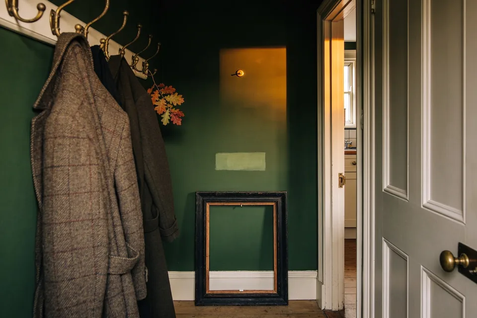
There is a stretch of wall in the hall, between the coat pegs and the kitchen door, that the sun only finds in October. Most of the year it keeps to itself; then one afternoon the light comes in low and lands on the three small frames hanging there, and the paper inside them — seed heads, a turning oak branch, grasses gone to bronze — goes briefly amber, as if it had been waiting all year for exactly this. It had. It was made for it.
Fall decorating tends to stop at shoulder height. The wool arrives, the pumpkins arrive, the lamps come on earlier — and the walls stay in July, holding the pale prints and the beach photograph and whatever else was framed the year the household moved in. Yet the walls are the largest surfaces in any room, and paper is the quietest, cheapest way they can turn with the year. This is a guide to the six prints that hang in these rooms every autumn — the amber autumn pack — and to the small crafts around any print on a cottage wall: printing it honestly at home, finding frames that deserve it, knowing which rooms it belongs to, and putting summer away without losing it.
Why paper belongs in a cottage autumn
A framed picture feels like a decision made once and defended forever — which is why most walls stand in the same dress from January to January while everything below them turns with the year. But the permanence is the frame talking, not the paper. A print is art at its most relaxed: it costs little, hangs light, and steps down without ceremony when its season ends, owing nothing and owed nothing.
Autumn rewards this more than any other season. The fall this house keeps is the amber autumn — light first, then color, then texture, arriving by degrees from late August to the hearth — and the walls belong in that sequence too, somewhere after the lamps and before the deep wool. Early October, say, when the light has gone low and warm and the pale summer print over the hall table has quietly stopped making sense. A wall that turns with the leaves does more for a room than a mantel of pumpkins, because it turns the room's largest surface toward the season instead of its smallest shelf. And paper asks so little for the work: a sheet, a frame that already existed, ten minutes with the kettle on.
What the amber autumn pack holds
The six prints were gathered the way the rest of the season is: by paying attention to what the walks and the windowsills were already offering. They are quiet botanical and still-life studies, and every one keeps to the same shelf of colors the house runs on from September through November — umber, ochre, madder, moss, and the deep browns that sit underneath all four.
One is a study of seed heads, papery and upright, the kind that hold their posts at the field's edge long after the flowers are forgotten. Another follows a single oak branch caught mid-turn, its leaves halfway between moss and madder. The dried grasses lean the way they lean in the jug on the sill, gone entirely to bronze. The rosehips carry the deepest red in the set — madder on the bare stem. A fern has gone over to rust and ochre, frond by frond, the last of its green nearly spent. And the sixth is a small still life, russet pears in a plain bowl: the kind of harvest that is admired for a week and eaten in an evening.
None of them shouts. They were made to hang a foot from a doorframe and be seen twice a day in passing, which is most of what wall art in a real house is ever asked to do — and they were made for these rooms first, hung and moved and lived with until each had found its wall.
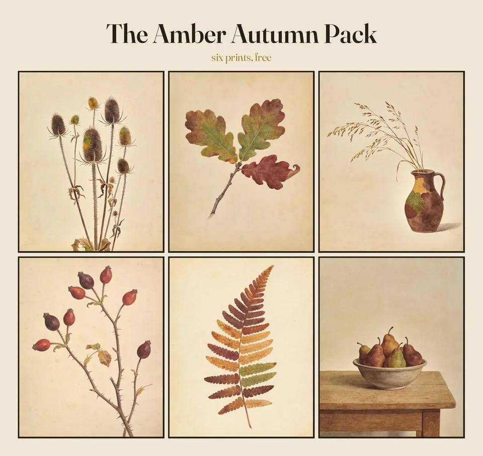
If they would sit as well in your rooms, the set is yours — free, from this house to yours. All six prints, sized to print at home at anything up to 8×10 inches or A4, ready for whatever frame the thrift shop offers next. Leave an email address and the pack will come to you.
The amber autumn pack, free
All six prints, sized to print at home at anything up to 8×10 inches or A4 — from this house to yours.
Six prints by email, and an occasional note from the cottage after that — no more. Leave whenever you like.
Printing them well at home
The one change that matters is weight. A heavy matte paper — card stock, or the matte photo paper sold in the same aisle — lies flat, holds the color up where the eye can reach it, and turns a page into a print. Everyday printer paper is made for letters, and it says so the moment it is asked to do more: heavy color ripples the sheet, the image shadows through from the back, and the page never quite feels like a picture.
Matte rather than gloss, and for a reason beyond taste. A glossy sheet hands the room back to itself: every lamp and window becomes a white glare sliding across the picture. These are prints for rooms that run on low side light, and matte paper takes lamplight the way wool does — it keeps the warmth and returns no shine. Deep browns on gloss read like a brochure; the same browns on matte read like the season.
As for the machine, honesty serves better than ambition. An ordinary home inkjet, set to its best quality and told the truth about the paper it has been given, makes a print worth framing at these sizes. The colors will land a shade away from the screen — they always do — and this palette forgives it: a print that lands a step deeper into brown has landed deeper into the season, and no harm done. Print a small test on plain paper first to see where the colors fall, and let the finished sheet dry for a while before it goes under glass.
The print shop earns its keep in three cases: when there is no printer in the house; when the house's printer is a laser that mostly does forms, which will render these warm browns cooler and flatter than they deserve; and when the hall wants the full 8×10 on heavier stock than the home tray feeds happily. The photo counter at an ordinary drugstore makes an 8×10 for very little. Ask for matte there, too.
Frames that have already hung something
A new frame does one thing for a print: it holds it. An old frame does two — it holds it, and it lends it a past. Thrift shops and rummage tables are full of frames priced for the wood and the glass rather than for the faded certificate or the needlepoint inside, which can be thanked and set aside. The wood on offer is often better than anything in the frame aisle: oak gone dark, gilt rubbed soft at the corners, small hardwood frames from the decades when small pictures were the ordinary kind.
What to check is short. Corners still tight; glass present and whole. If the glass runs slightly wavy with age, better still — a print behind wavy glass looks as though it has hung in the house through two owners. The finish may be worn wherever it likes; that is the point of it. This is the same habit the kitchen already runs on — choosing things that have already lived over things manufactured to look as if they had — carried out of the pantry and up the wall.
Sizes will not cooperate, and they do not need to. A frame a little large is solved with a mat — reused from the frame's first life, or cut by hand and allowed to be imperfect — or by letting the print sit small against the backing with a plain border showing on every side. And matching is neither required nor wanted: the six were made to hang in company like family, not like uniform. Six prints in six frames that never met before this wall is not a compromise. It is the effect.
Where fall prints belong in the house
The rule that decides placement is short: prints go where the household passes and pauses, not where a gallery would put them. A picture hung for guests is seen twice a year; a picture hung by the kettle is seen every morning of its season.
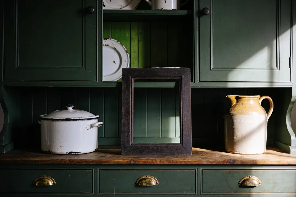
The pantry wall may be the best wall in the house for this work. Small prints do their finest job among working things — between open shelves, above the enamel pitchers, beside the door frame — where they hang like one more kept object rather than an exhibit. The kitchen's deep colors are the pack's native ground, too: against moss or umber walls — the slow turn a moodier cottage kitchen makes the long case for — the amber palette warms under lamplight the way brass does. Two cautions only: keep paper across the room from the stove — a kitchen deep in its autumn runs on steam, and steam and spatter are hard on a print — and let the working wall keep its boards and hooks. The print takes the quiet wall, and the room balances. And if the kitchen wall takes to the work and wants subjects of its own year-round, six studies of the working kitchen — copper, herbs, the garlic braid — hang in our Etsy shop, drawn on the same parchment ground.
The hall carries the heart of the set in this house — that wall between the coat pegs and the kitchen door, narrow and passed twenty times a day. Halls are unkind to large art and kind to small: a pair of prints hung close, at the eye height of someone walking through, turns a corridor into a room. And above the reading chair is the third post — shoulder height to a sitting person, inside the lamp's low circle, where the print joins the chair and the wool as part of the evening's furniture.
Hang them in twos and threes, a hand's width apart — closer than instinct suggests — and by eye rather than by level. Frames spaced with instruments read like a hotel corridor; a small cluster set by eye reads like it accumulated, which is the truth. The one wall to refuse them is the one that takes full sun through bare glass: strong daylight is hard on any print, and the sunniest wall was always better given to a mirror. Paper keeps to the quieter light — and by October, the quieter light is most of the day.
The seasonal swap, and where summer sleeps
Prints change with the seasons the way textiles do, and the mechanics could not be simpler: the frames keep their nails, and only the paper moves. Some weekend in late September — the same one that puts the striped throw and the jar of beach stones away — the frames come down, open at the back, and trade their summer for their autumn. Ten minutes, no tools, and the largest surfaces in the house have turned with the smallest.
Summer sleeps flat. Slip the off-season prints between two sheets of plain paper, lay them in a folder, and give the folder to a drawer or the linen cupboard — anywhere dry, dark, and flat. Rolling is the one mistake; paper remembers a tube, and a print stored rolled comes back a scroll. Stored flat, it comes back in spring exactly as it left.
And a print is allowed to be mortal. Enough years of light will soften and fade it, and none of that is failure — it is paper, doing what paper does. When one of the six goes past its best, print it again and let the wall start the season fresh. The set does not wear out; only its copies do.
Whatever else gets made for these walls will gather with the rest of our printables as the seasons ask for it — and the longer case for paper in a kept house, room by room, is its own piece. Six more harvest studies, orchard apples and quince preserves and a cottage loaf on its board, make up The Autumn Larder on our shop page.
Tonight, one nail
Start before anything is printed. Tonight, walk the house once and find the most summer thing still hanging — the palest print, the beach photograph, the frame no one has looked at since June — and take it down. Stand it in the cupboard with some gratitude. Then leave the nail empty for a few days and watch what the October light does with the blank wall on its way through. An empty nail in autumn is not a gap in the decorating; it is a place laid at the table, and the season knows how to fill it.
Common questions
Are the six fall prints really free?
Yes — all six, sized to print at home at anything up to 8×10 inches or A4. Leave an email address and the pack comes to you, along with an occasional note from the cottage afterward — no more than that, and you can leave whenever you like.
What paper should I use for printable wall art?
Heavy and matte — card stock, or the matte photo paper sold in the same aisle. Weight is the one change that matters: ordinary printer paper ripples under heavy color and shadows through from the back. Matte over gloss, because a glossy sheet turns every lamp and window into a white glare sliding across the picture.
Can an ordinary home printer make prints worth framing?
Yes — an ordinary inkjet at its best quality makes a print worth framing at these sizes. Colors land a shade away from the screen, and this palette forgives it: a step deeper into brown is a step deeper into the season. If the house printer is a laser, the drugstore photo counter makes an 8×10 for very little — ask for matte.