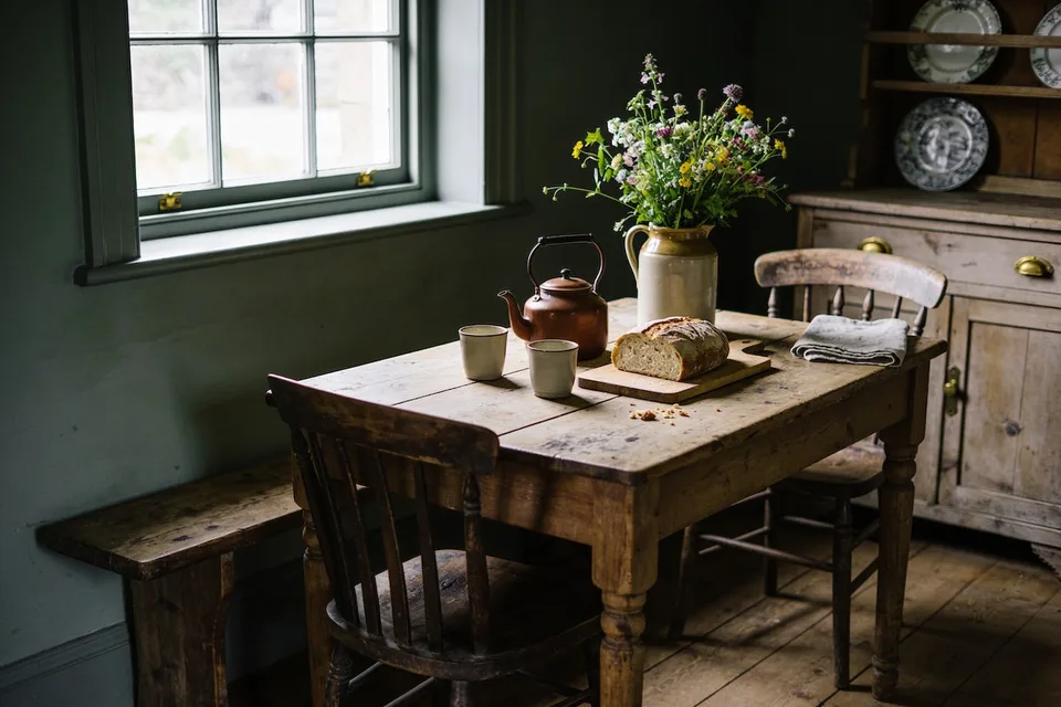
 Cottage at Home
Disclosure: some links below are affiliate links — buy through one and we may earn a small commission, at no extra cost to you.
The dark cottage kitchen: paint, brass, and low light
Deep paint chosen for your light, brass gone soft with handling, lamps after supper — the moody cottage kitchen, taken darker and warmer at once.
In this guide
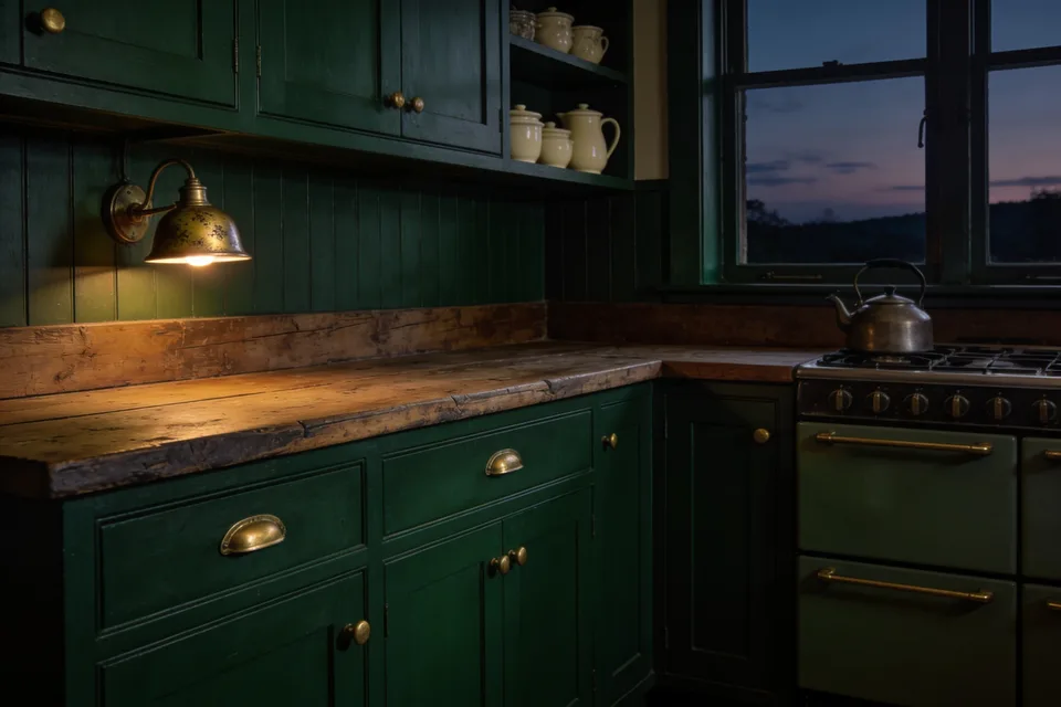
By half past four in late autumn the kitchen stops pretending it is daytime. The window over the sink gives up its last gray light, the kettle begins its low climb, and the walls — a green so deep it reads as shadow until the lamp comes on — do what they were painted to do, which is hold the room close. A brass latch glints where a hand has worn it bright. This is the hour a dark cottage kitchen is built for.
Taking the room darker is not the act of nerve the before-and-after photographs make it look like. It's a short sequence of small, mostly reversible decisions — a paint color chosen against your own light, hardware allowed to age, lamps where the overhead used to be — and every one of them can be tested before it has to be trusted. Here is that sequence, in the order we'd take it.
The pastel years, and what they grew into
A moody cottage kitchen is the kitchen of the pastel years, further along in its life. The greens deepened toward moss and bottle. The pine went amber where trays and forearms rubbed it. The brass stopped being polished and started being handled. For a few years the cottage kitchen was photographed almost entirely in pastel: whitewash, blush, a sage the color of sugared almonds, everything new and matte and lit like ten in the morning. It was sweet, and it was thin — rooms styled to look kept rather than rooms that had been kept. What has happened since is not a backlash so much as a seasoning.
This matters practically, not just as history, because most of what gets gathered under cozy cottage kitchen decor — the bread boards, the cream stoneware, the dried stems in a jug — reads twice as warm against a deep wall as against a pale one. Cozy was never a color. It is the feeling of a room whose edges have gone soft, and depth is the fastest honest way to soften an edge. The kitchen is the working heart of the cottage, and most of what we keep in the kitchen and pantry follows from how this one room holds its evenings.
Choosing deep paint: depth is not darkness
The common mistake is to hear "dark" and reach for black — a flat, single-note charcoal that swallows lamplight and gives nothing back. What a dark kitchen actually runs on is depth: a color complicated enough to change through the day. The greens that work hardest have brown in their base, so that at noon they read as leaf and by supper they read as shadow with something alive in it. The blues want gray folded in. Even the near-blacks should lean somewhere — toward green, toward brown — never toward nothing.
A quick test in the shop: look at the chip beside the window, then again further inside. A color with depth changes its mind between the two — greener here, browner there — where a flat color only gets lighter and darker. Buy the one that changes its mind.
The directions that earn their keep:
- Moss and bottle greens. The heart of the palette. Brown-based greens flatter everything wooden that stands against them, and they hold their warmth after dark instead of going to slate.
- Bronze and deep olive. The warmest of the dark family, with the most fire banked in. This is the safest direction for a cold or dim room.
- Ink and slate blues. Blues want gray in them here — closer to a fountain pen than to a summer sky — or they turn seaside the moment the sun finds them.
- Brown-blacks and green-blacks. For the committed. A near-black with brown or green in its base holds candlelight; a true black only swallows it.
As for where the first coat goes: cabinets take deep color more gracefully than walls, and lower cabinets most gracefully of all. Depth below the counter grounds the room the way dark soil grounds a garden, and it leaves the upper half light to work with. Walls can follow once the cabinets have been lived with through a winter.
North light, south light, and the swatch that lives on the wall
A north-facing kitchen gets cool, steady, gray-blue light all day. It is honest light but not generous: it drains cool grays toward concrete and can make a blue-black feel like a cellar. North rooms want warmth folded into the depth — olive, bronze green, umber-brown — colors with a little fire in them. A south-facing kitchen gets warm light that moves, and it can carry nearly anything; a green-black that would sulk in a north room glows in a south one by late afternoon. East gives its best light at breakfast, west at supper, and the room changes its mind accordingly.
Which is why the swatch has to live on the wall before the color is chosen. Paint two coats onto poster board, a proper size — the length of your forearm, not a postage stamp — and pin one piece beside the window and one on the wall facing it. Leave them up for a week. Look at them at eight in the morning and again by lamplight. The color that survives both viewings is the one to buy, and no chart in a shop can tell you which that will be. This depends on your light, entirely, and the week of looking is the only way to learn it.
One plain word on finish: the flatter the paint, the deeper it looks, but a kitchen wall needs wiping. Choose the lowest sheen the room can practically live with — the wipeable eggshell-type finishes hold depth well — and save dead-flat for the ceiling.
Brass that has been handled
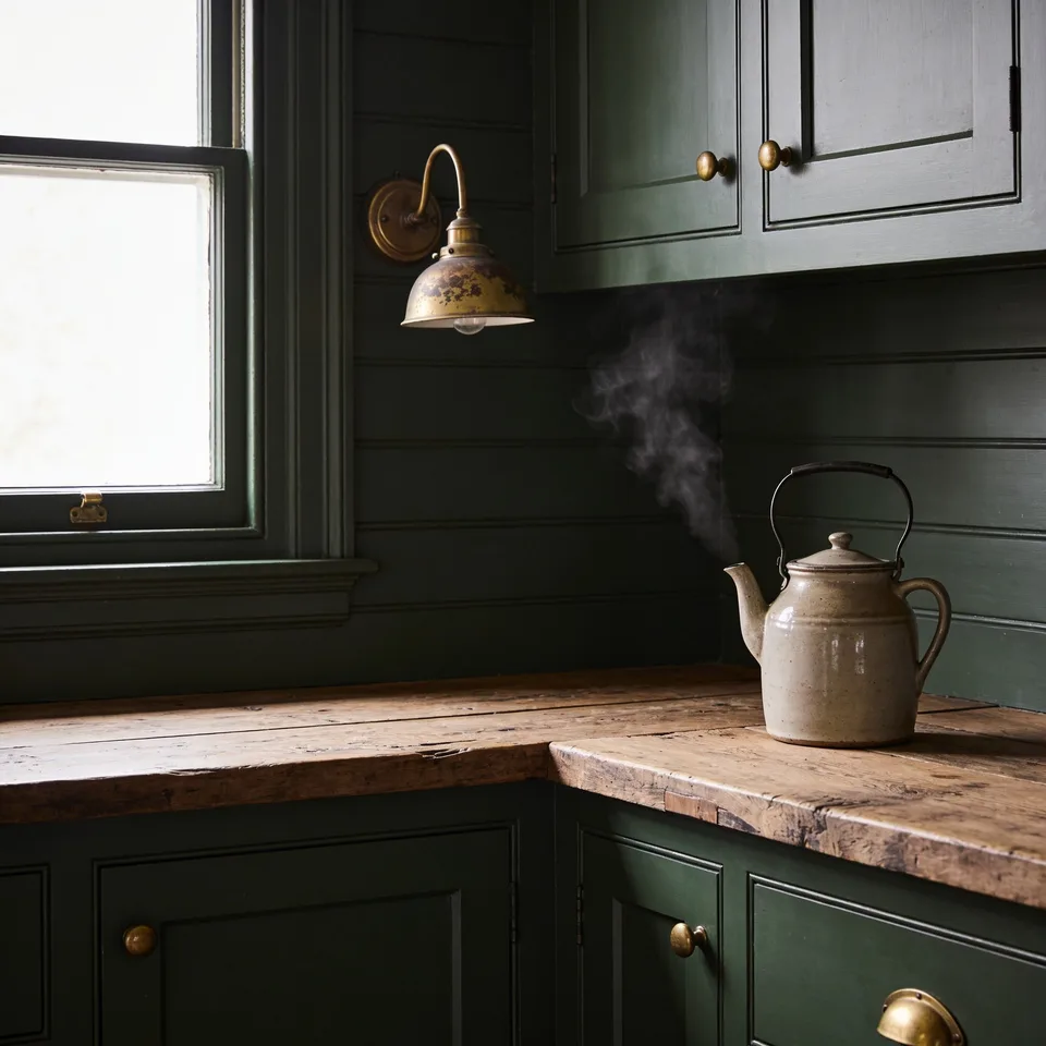
Brass belongs in a dark kitchen because it keeps a record. An unlacquered latch darkens where it is left alone and stays bright where fingers find it every day, and after a year that map of use is the best thing in the room. Buy living finishes — unlacquered, unplated — wherever there is a choice, and then do the hard part, which is nothing: no polish, no schedule, just handling.
The hardware does not need to match in age or even in pattern. A drawer of secondhand cup pulls, a new latch, a hook that came with the house — mixed ages read as accumulation, which is what a kept kitchen is. What to pass over is the "antiqued" finish, patina applied by machine in one even coat; real wear is uneven because hands are. Lacquered brass, sealed to stay mirror-bright forever, fights a deep wall too — it stays loud while everything around it goes quiet.
If the budget allows one change, change the pulls on the most-used run of drawers and leave the rest for later. New unlacquered brass arrives bright and settles into itself within a few months of cooking. You are not buying patina; you are buying the conditions for it.
Lamplight, not the overhead
Most kitchens are over-lit from a single point in the ceiling, and everything under that one bright fixture goes flat — shadowless, even, and unkind to depth. Deep paint cannot do its work under glare; it reads as gloom instead. The fix is the one the rest of the house already knows: lamps, layered, low.
A small lamp on the counter, in the corner farthest from the sink and the stove, is the single fastest change in this whole piece. It makes the kitchen a room rather than a workstation the moment it comes on. Add a wall light over the shelves if there is wiring, or a plug-in one if there is not. Keep honest task light where the knives are — a slim strip under the shelf or the upper cabinet, aimed at the board — because atmosphere is no excuse for chopping in the dark. Then put whatever remains of the overhead on a dimmer and keep it for cleaning, not for living.
Keep every bulb warm and keep them matching: 2700K or lower, the kind sold as warm white, never daylight. A deep green wall under a cold bulb goes lifeless; the same wall under warm light does what candlelight does to old wood, which is find the life in it.
Wood tones and the open shelf
Deep walls push wood forward — that is half the reason to paint them. Aged oak, elm, old fruitwood, anything mid-toned with some years in it, stands against moss or ink in a way it never quite manages against white. Very new, very orange pine is the one wood that argues with deep greens; a coat of dark wax calms it, and so does time.
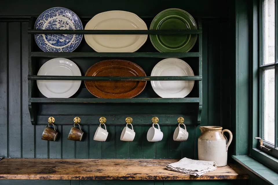
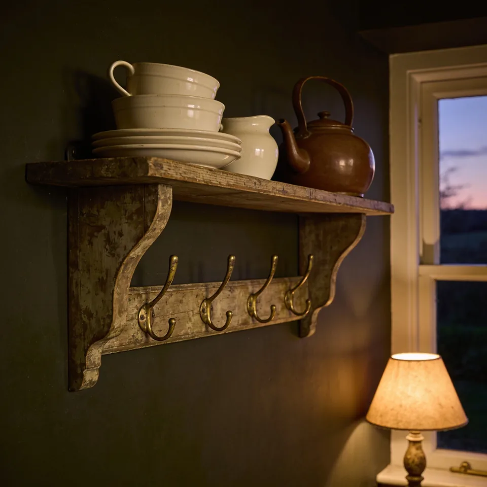
On the shelves themselves, the rule of a working kitchen holds: what earns a place is what gets used. Cream stoneware, a stack of plates worn at the rim, the brown teapot, boards that have taken a knife for years — against a dark wall these stop being storage and start being still life, without a single thing bought for looks. Decorating with things that have already lived — the chipped enamel, the handed-down boards — is its own subject, taken up properly in vintage cottage kitchen decor; the short version is that a mark of use is a reference, not a flaw.
Cloth that has seen some winters
Textiles carry depth into the parts of the kitchen paint cannot reach. Swap the bright-white towel set for linen in oatmeal and an umber stripe; linen washes softer every year and looks better crumpled than folded, which is fortunate. Put wool underfoot where you stand at the sink — a small runner in a madder or moss pattern — because wool holds lamplight better than cotton and forgives a dropped spoon better than tile does.
And dress the window, even a little. At night an undressed kitchen window is a black mirror, and it will spend the whole evening reflecting the room's one glare back at it. A café curtain in heavier linen, or a plain Roman shade lowered halfway, turns that black pane into a soft edge. The room closes like a drawn curtain, which is rather the point of the whole exercise.
Renting, or starting with one quart
None of this requires owning the walls. In a rented kitchen, take the depth into the layers that move: the counter lamp first, then dark-ground textiles, then a runner, then frames — prints matted wide in near-black frames will gather a pale wall toward depth without a brush ever coming out. The prints themselves are the cheapest part of the layer: ours are free — botanicals in the same umber-and-bronze register this room runs on — printed at home for the price of the sheet. For walls that want the kitchen itself on paper, a set of six kitchen studies — the copper pot gone green with use, the garlic braid, the brass scales — hangs in our own Etsy shop, drawn in the same register. Swap the cabinet pulls for unlacquered brass and keep the landlord's originals in a labeled bag in the junk drawer; it is a ten-minute change in either direction. A freestanding piece — a small bench, a stool, a shelf unit — can be painted as deep as nerve allows, because it leaves when you do.
If painting is permitted, or the kitchen is yours but the budget is small, one quart of deep paint on the wall the lamplight lands on will do more than a hundred dollars of objects. Paint is the cheapest depth there is; the secondhand market is the cheapest brass; the lamp can come from a thrift shelf so long as the bulb inside it is warm.
How dark is too dark for a small kitchen
The true limit is working light, and the test for it is plain. Stand at the chopping board at seven in the evening under the lights you actually use. If a recipe card reads easily where it lies, the room has light to spare and can take more depth than it has. If you find yourself leaning toward the window to read it, solve the lamps before the paint. And when light is genuinely scarce — one small north window over a galley, say — keep the wall the window faces pale, take the depth below the counter and onto the far short wall, and leave the ceiling a soft white so the lamplight has something to come back from. The room will still read as moody, because depth placed low reads from every angle. But supper will not be cooked by feel.
Smallness is not the obstacle it is assumed to be. A deep color dissolves the corners of a room, and a room without visible corners stops announcing its size — which is why a small study painted near-black feels like a den rather than a closet. Small kitchens can take real depth, and they often wear it better than large ones.
One supper by lamplight
Before any chart comes home, spend one evening finding out what the room already wants. Turn the overhead off at dusk, cook by lamp and stove light, and notice, while the kettle does its work, which wall the lamplight lands on and warms. That wall is where the first deep color goes.
Common questions
What paint colors work for a moody cottage kitchen?
Colors with depth — complicated enough to change through the day. The hardest-working greens have brown in their base: moss, bottle, deep olive. Blues want gray folded in, and a near-black should lean toward green or brown, never toward nothing. In the shop, buy the chip that changes its mind between the window and the back of the store.
Is dark paint a mistake in a small kitchen?
No — a deep color dissolves the corners of a room, and a room without visible corners stops announcing its size. The true limit is working light: stand at the chopping board at seven in the evening, and if a recipe card reads easily where it lies, the room can take more depth than it has.
Why does dark paint look gloomy in some kitchens?
Usually the overhead is to blame. Deep paint cannot do its work under a single bright ceiling fixture — everything goes flat, and depth reads as gloom instead. Lamps, layered and low, are the fix: a small warm-bulbed lamp on the counter is the single fastest change in the whole room, with every bulb at 2700K or lower, never daylight.