 Cottage at Home
Disclosure: some links below are affiliate links, and if you buy through one we may earn a small commission, at no extra cost to you.
Cottage bedroom colours: choose the bed first, then the walls
Cottage bedroom colours start on the bed: the quilt, the blanket and the curtains are the biggest colours in the room, so choose them first and paint the walls to sit behind them.
In this guide
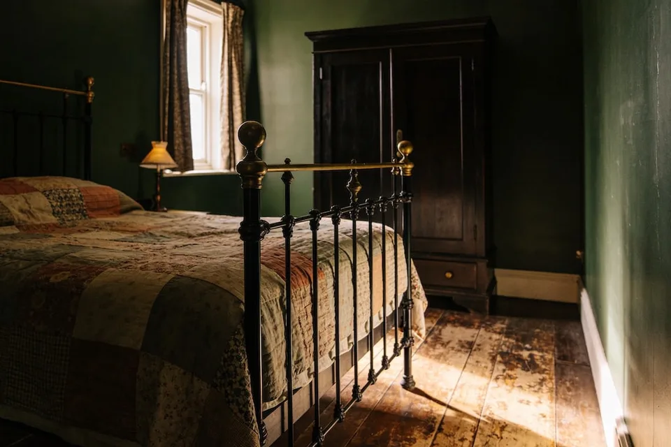
Lie down on the bed and look at the room. Most of what you see is cloth: the quilt across your knees, the blanket at the foot, the curtains at the window. The walls are behind all that. This page chooses cottage bedroom colours in that order, starting with the bed you have, because that is where the colour of a bedroom really lives.
What colours suit a cottage bedroom?
Start with the bed's colours, because a quilt, a blanket and a pair of curtains cover more of what you see than any wall. Then choose a wall colour that sits behind them: a warm pale such as cream or stone, or a deep green, a soft blue or a dusty pink with some grey or brown in it.
That is a short list on purpose. Lists of cottage colours run to sage, butter, blush, duck egg, lilac and forest green, and all of them can be lovely. In a bedroom, though, the bed is already carrying several colours at once, often the five or six of an old patchwork quilt. The walls do not need to add to them. They need to hold them.
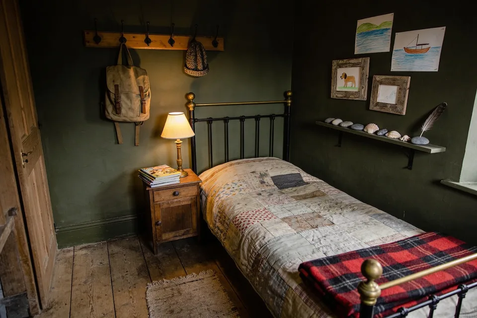
The picture at the top shows the idea. The quilt is rose, cream, faded blue and green; the walls are one deep green; the wardrobe and the floor are brown. The quilt has all the colour, and the walls make it look chosen.
Why the bed decides, not the walls
The bed decides because it is the biggest colour in the room and the one you look at most. It is also the one you already own and can change by season. Paint stays for years, while a blanket can come off in May, so choose the walls to suit the cloth.
Most people do it the other way round. They pick a paint chip at the shop, paint the room, and then go looking for bedding to match the walls, which is harder than it sounds and expensive besides. Hold the paint chip against your quilt first. If the two look happy together on the bed, they will look happy on the wall.
The quilt you love is a good place to begin even if it is old and faded, or especially then. Faded colours are soft by nature: a red worn to rose, a navy gone to slate. They tell you the kind of wall colour that will sit well behind them, which is usually a softer, greyer one than you would have picked from the chart.
The quilt, the blanket and the curtains
Think of the bed in three layers: the quilt or cover, the blanket folded at the foot, and the curtains at the window. Let one of them carry the pattern and keep the other two plainer. A patchwork quilt wants a plain wool blanket; a striped blanket wants a quieter cover.
Bring them down one shade from white. A bright white duvet is the brightest thing in a room at night, and the eye keeps going back to it. Cream, oatmeal, a soft stone or a washed-out colour all sit better under a lamp. Our dark cottage bedroom page goes further into bedding for a deep-walled room.
If the bed is bare and you are starting over, a vintage chenille bedspread in cream or a faded colour gives a pale bed with some texture, and it suits nearly any wall. For a deeper bed, a vintage wool bedspread in a dark red or green carries the colour on the bed, and the walls can stay pale. The curtains are the third layer and the easiest to forget. They hang beside the wall, so let them sit between the bed and the wall in depth: a little darker than a pale wall, or a little lighter than a deep one.
Walls behind the bed: pale or deep
Either works, as long as the colour is warm. A bedroom is mostly seen by lamplight at night and in grey light first thing, so a cool bright white can look cold and flat, while a warm cream or a deep green with brown in it holds up at both hours.
A pale bedroom goes cold for one reason: the white is too blue. Under a warm bedside lamp a cool white turns a dull grey, and in a north-facing room at seven in the morning it looks like a hotel. A white with a little yellow or red in it, a cream, a stone or an old plaster colour, keeps its warmth at both hours. Take the ceiling the same colour or a step lighter, and the room feels like one piece.
A deep bedroom works for the opposite reason: there is so little daylight in it to spend. The case for going dark, and how to test a colour at ten at night and seven in the morning, is set out on the English cottage bedroom page. The short version is to paint a large card and live with it at those two hours before buying a can.
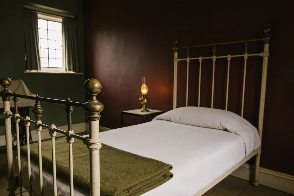
Two deep colours can share a room if they are the same depth. In the guest room above, one wall is green and the other a deep brownish red, and they get along because neither is brighter than the other. The pale bed and the olive blanket sit in front of both.
Green walls in a cottage bedroom
Green is the easiest wall colour for a cottage bedroom, because nearly every quilt and blanket looks right in front of it. Choose a green with some brown or grey in it, from a soft sage to a deep moss or bottle green. A bright, clear green looks new under a lamp; a brownish one looks old.
The green and the bed can be the same family without matching. A deep green wall with a moss blanket and a cream cover is calm. A sage wall behind a faded rose-and-blue quilt is the older English cottage look, and it suits a room that gets morning sun.
Pale green is the gentlest way into colour if a whole deep room feels like too much. It reads almost as a warm neutral by lamplight and as a soft colour by day, and it is kind to brass, old wood and white-painted iron.
Blue in a cottage bedroom
Choose a blue with grey or green in it, never a clear sky blue. Under the warm bulbs most bedrooms use, blue loses some of its colour and drifts toward grey or green, so a greyed blue keeps its look at night where a bright one goes flat.
That shift is the reason to test blue under your own bedside lamp before you commit. Paint makers' own tests show a blue-grey picking up a yellow, slightly green cast under a warm bulb. A soft grey-blue or a duck egg will hold up well, and a dark slate blue with a cream bed is lovely in a room that is mostly used at night.
Blue suits a faded quilt with blue already in it, a navy-and-cream ticking stripe, or plain white-painted furniture. With a warm wooden floor and a brass lamp, a greyed blue looks settled rather than cool.
Pink, and the country cottage bedroom
Pink in a cottage bedroom works best faded: a dusty rose, a plaster pink or a pink with brown in it. The old country cottage bedroom pairs it with green, often a rose-and-green floral on the bed or the curtains, and a soft pink wall behind it is the gentlest version of that look.
Keep the brightness down and the pink feels grown-up. A plaster pink wall with a green wool blanket and an iron bed is warm without being sweet. A deeper rose or a browned red works in a room that is mostly used at night, as the guest room picture shows.
The floral can come from cloth rather than paint. A vintage eiderdown in faded chintz across the foot of the bed brings the rose and green together, and the walls can stay a plain warm pale behind it.
Which paint finish for a bedroom wall?
Matte or eggshell. A bedroom wall is not scrubbed the way a kitchen or hall wall is, so the flatter finishes are a good fit: matte hides the dents of an old wall best and makes colour look deeper, and eggshell wipes clean a little more easily.
Matte can mark more easily and is harder to touch up, so in a child's room, or where a bed head rubs the wall, eggshell or satin is the practical choice. Keep a little of the paint for later touch-ups; with the flatter finishes, a patch done months later can show, and sometimes the whole wall needs a fresh coat.
Woodwork can go one of two ways: the same colour as the wall, which makes a small room feel bigger and an old one feel more of a piece, or a warm off-white in a slightly tougher finish. Either is right in a cottage bedroom. A bright white skirting under a deep wall is the only choice that tends to look out of place.
Start with the blanket at the foot of the bed
Before you buy any paint, choose the blanket. Fold it at the foot of the bed, put a lamp on, and hold your paint cards beside it at night and again in the morning. The colour that looks right with the blanket at both hours is your wall.
If you already love the walls and the bed feels wrong, turn it round: keep the paint and change the blanket. It is the cheapest change in the room and the quickest to undo. For the rest of the room, the English cottage bedroom covers the bed, the window and the lamps, and the guest room page has a short list for a room someone else will sleep in.
Common questions
What colours suit a cottage bedroom?
Start with the bed's colours, because a quilt, a blanket and a pair of curtains cover more of what you see than any wall. Then choose a wall colour that sits behind them: a warm pale such as cream or stone, or a deep green, a soft blue or a dusty pink with some grey or brown in it.
Should a cottage bedroom be painted light or dark?
Either works, as long as the colour is warm. A bedroom is mostly seen by lamplight at night and in grey light first thing, so a cool bright white can look cold and flat, while a warm cream or a deep green with brown in it holds up at both hours.
What paint finish is best for bedroom walls?
Matte or eggshell. A bedroom wall is not scrubbed the way a kitchen or hall wall is, so the flatter finishes are a good fit: matte hides the dents of an old wall best and makes colour look deeper, and eggshell wipes clean a little more easily.